A Dream-like Menu
The aim of this four-month project was to examine atmosphere in games by researching current techniques and existing atmospheric games, as well as undertake a full cycle of the design process. I started with games I enjoy that I felt had a strong sense of atmosphere, such as Castlevania: Symphony of the Night (1997) and The Legend of Zelda: Twilight Princess (2006).
I noted that to me, both of these examples had dream-like qualities, and identified dreams as an interesting theme to explore through this project. Early ideas focused on including a variety of dreams and emphasised the seemingly arbitrary ways real dreams link together.

The above sketch includes four dreams, inspired by dreams I had had before. Each of these dreams would be accompanied by ambient noises, similar to those one might get from a sound machine used for sleep-aid.
Once I had decided on my idea, I began to think more critically about the stakeholders of my project. The project is important to me because I have trouble sleeping and also have vivid dreams. What should be restful is more often uneasy and restless. Many people sleep poorly and have intense dreams. Dreams are a cryptic yet ubiquitous experience, and so people look to them for meaning. From this, I was able to determine the primary stakeholders of my Dreamscapes: poor sleepers, vivid dreamers, and people who enjoy atmospheric games.
This brought me to the project's essential question: how do you represent the feeling of a dream through a video game? To answer this, I came up with a few requirements:
| Non-Functional | Functional |
|---|---|
| The game should emphasise soundscapes (“acoustic environment as perceived by humans”) because people who enjoy atmospheric games want an 'immersive' environment to explore | The game should at least be available on Windows/Mac because casual gamers and people who don't usually play games (could be troubled sleepers, psychologists and philosophers, vivid dreamers, etc) often have access to these platforms |
| The game should have thematically cohesive UI/loading screens because people who enjoy atmospheric games want an 'immersive' environment to explore | The game should be playable from beginning to end (at least a demo/vertical slice for scope) |
| The game should be unnerving/uneasy, because people with vivid dreams and people who have trouble sleeping want an authentic representation of dream states | The game should have limited player control because people who enjoy experimental experiences want to try varied perspectives on interaction |
| The game should have surreal visuals because people with vivid dreams and people who have trouble sleeping want an authentic representation of dream states | The game should have limited player control is to maintain the authenticity of a dream-like atmosphere (this may be sluggish but fits dream states) |
I also came up with a few words to describe the desired user experience, such as "sleepy", "unnerving", "hazy", "surreal", "relaxing", and "omnious".
To gather ideas, I created a moodboard, colour palettes, kept a dream journal, and researched existing techniques for creating atmosphere in games.
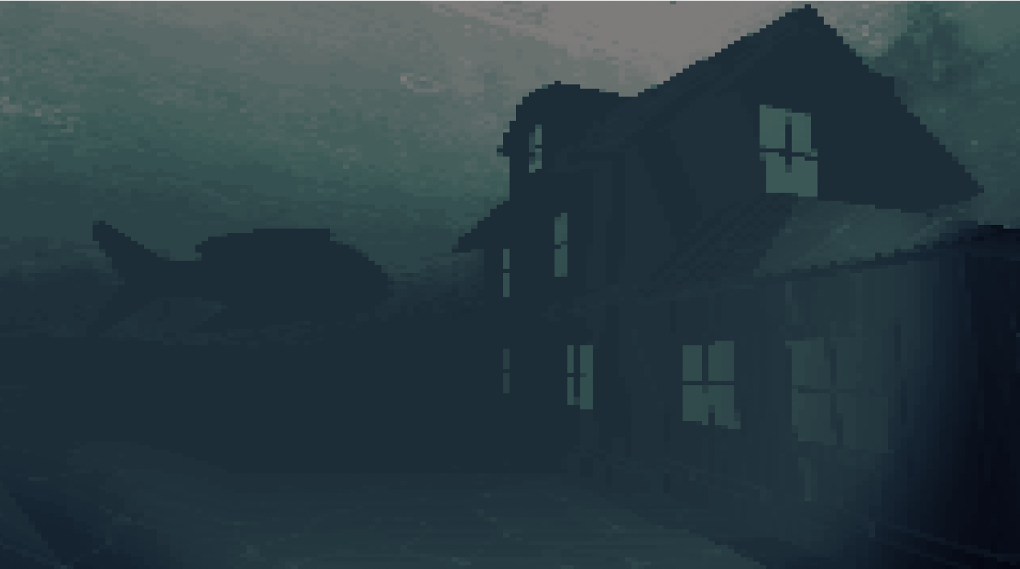
Some useful ideas came out of the dream journal, such as the haze that borders the underwater environment, representative of the border between dreaming and waking. Through my research I came across Greg Kasavin's GDC talk "Creating Atmosphere in Games". This led me to the concept of audiovisual thematic cohesion, or ensuring a game's audio and visuals (not just during gameplay) are cohesive with the game's themes.
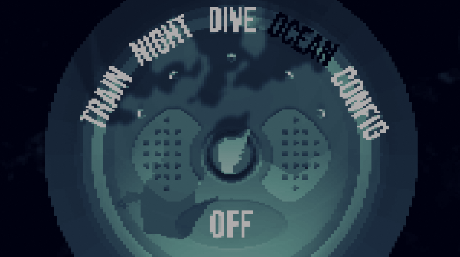
With this in mind, I had the idea to model the game's main menu after a sound machine (a sleep-aid device), so that the player's navigation of the menu would be recontextualised as the player character turning on a certain sound to fall asleep to. This ambient sound would inspire the dream-level the player explores.
To ensure the usability of this stylised menu, the design went through several iterations. The scope of the project was reduced from four levels to one to allot time for the menu.
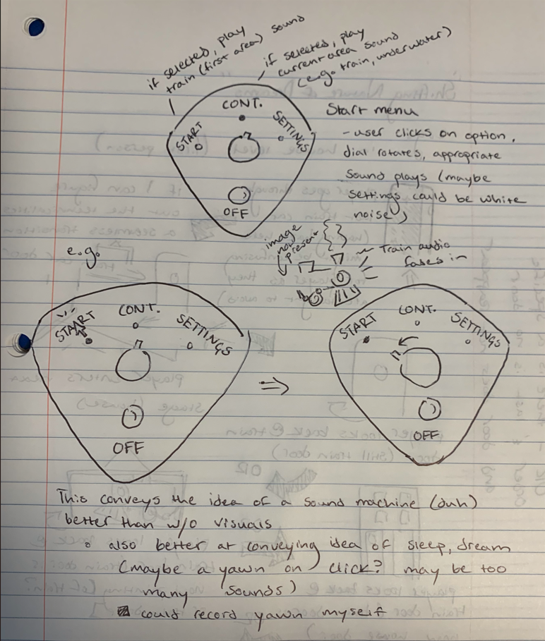
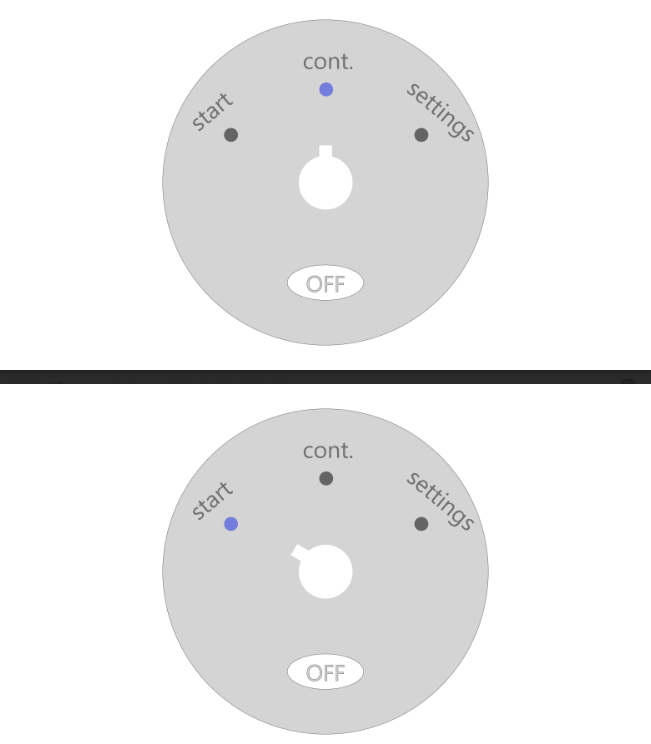
While the early designs followed typical game menu conventions, the buttons were vague and made it difficult to tell what the machine was meant to be. For this reason, I decided to make the design more accurate to that of a real sound machine.
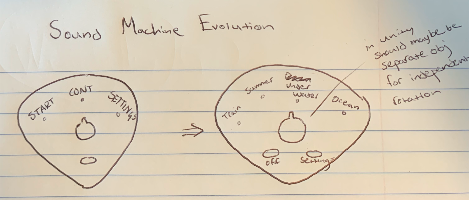
I wanted to make it as clear as possible that the menu was a sound machine, and thought depth would make the design read better than flat circles. I modelled the sound machine in Blender. The buttons and lights were added in Unity. I also added scrolling shadows to give the menu an air of mystery.
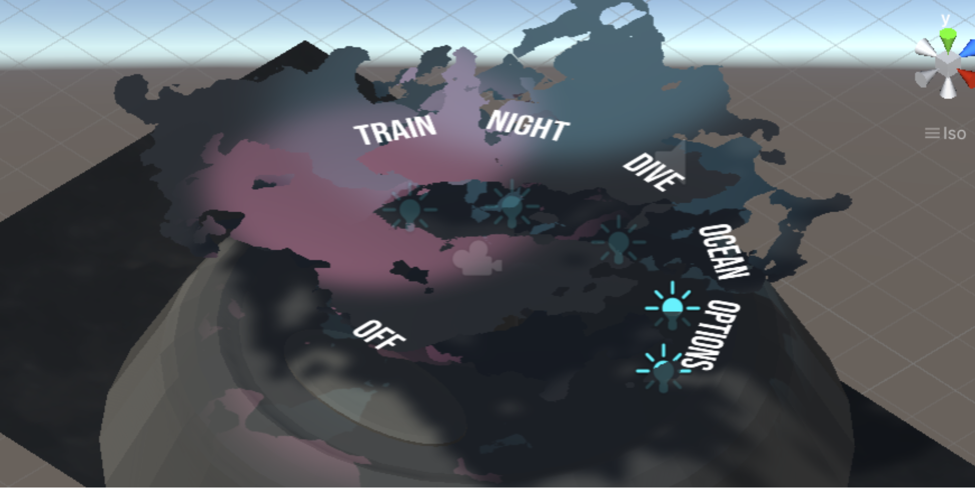
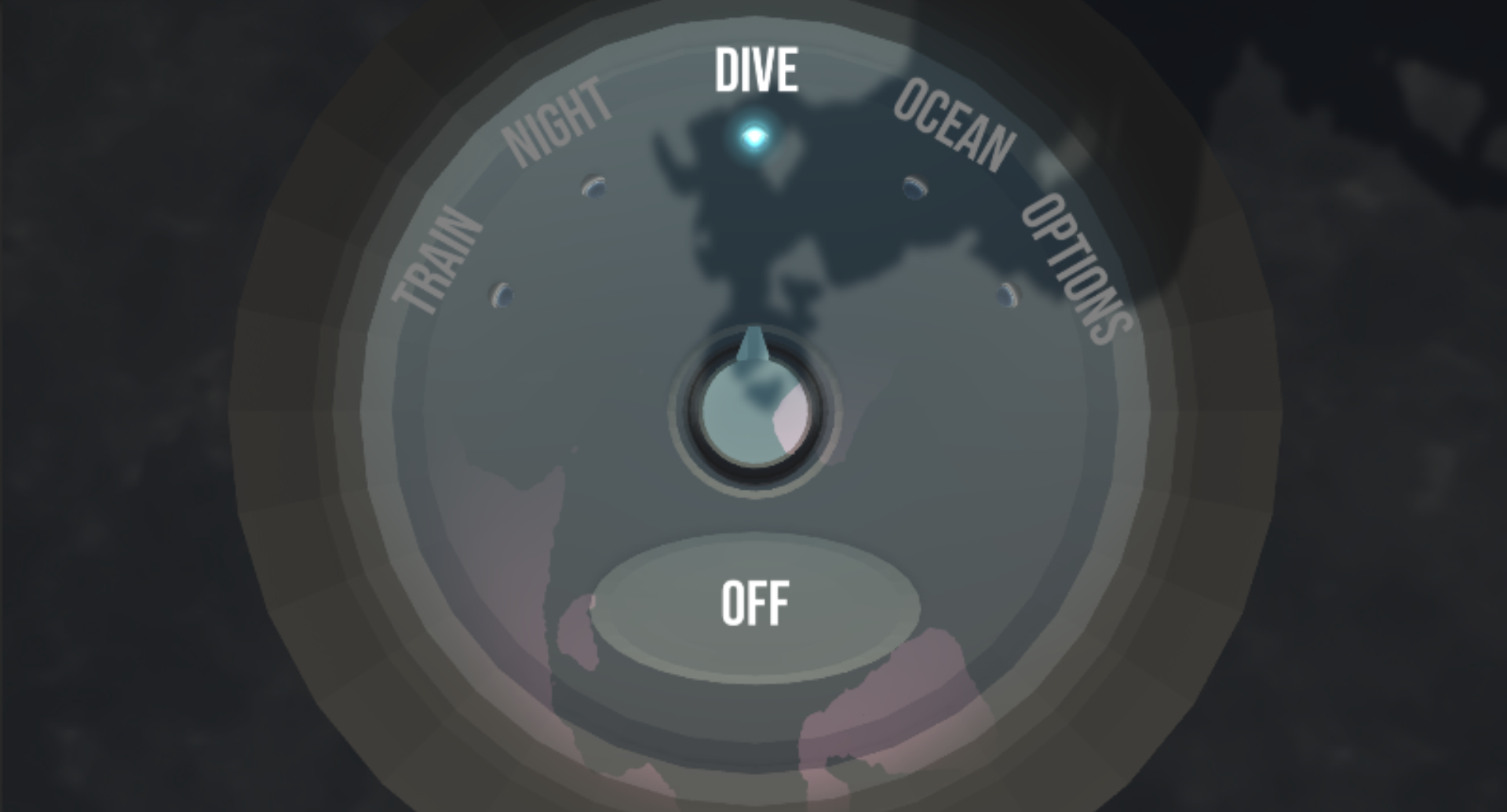
Finally, I wanted to add some pixelation, as I felt it lent itself well to the hazy nighttime/dream aesthetic the project was going for. In the dark, environments appear less detailed and more blurry. Dreams are even less clear. To this end, I used a Unity package from the creator RogueNoodle called "GBCamera for Unity."
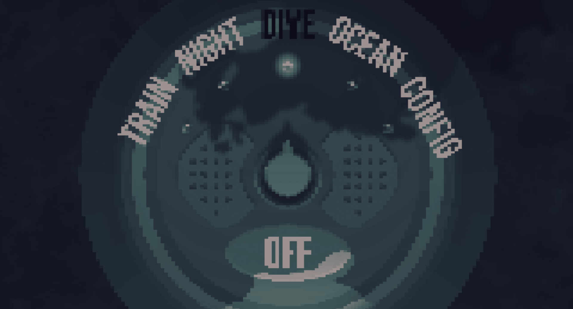
After adjusting some colours and scaling for readability, I came up with this final iteration of the menu. Further iterations might include a more detailed bedroom environment to make the menu more evocative of nighttime and sleep.
If you're interested in learning more about the development of this project, you can find the full report here.
