Designing on a Collaborative Project
The goal of this six-week project was work collaboratively with four other teammates to create an interactive project under an open brief. We began by individually brainstorming ideas and presenting them to each other so we could discuss what kind of project we would all enjoy working on. For this task, I referred back to my game idea document and looked for projects that might be acheivable within the relatively short time-frame.
One of my ideas seemed like it would be a good fit: a "Game with bouncing ball mechanic (press down to increase gravity), kind of like Dune, Tiny Wings, but momentum-based platformer with bounce instead of slope." Given the scope of the assignment, the core mechanics seemed both simple and expandable. I suggested the idea in our first meeting, and came up with these sketches:

After some deliberation, we decided to use the mechanic as the basis of our project, and assigned roles according to expertise and interest. As I was most familiar with the mechanic idea, I took on the role of lead designer and level designer, as well as gameplay programming.
I began by putting together a basic version of the player controller in Unity to use for a short demo during our pitch presentation. After the presentation I started brainstorming complementary level mechanics that would emphasise the core gameplay of rebounding to gain speed. I shared these sketches with the team and we discussed ways of incorporating them into the game as well as other possible mechanics.
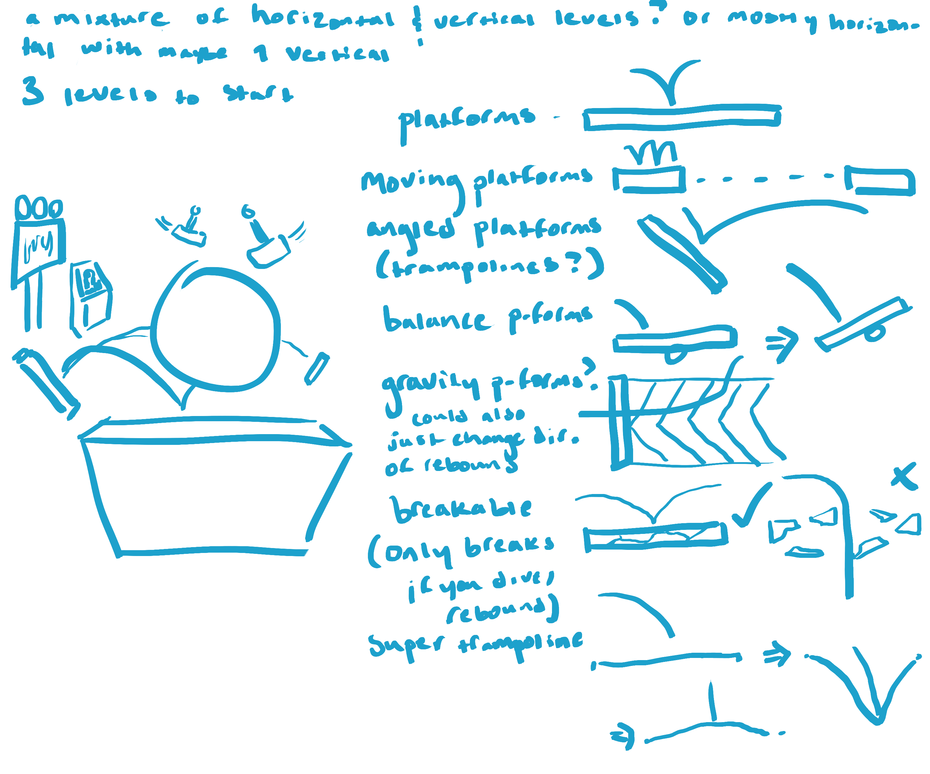
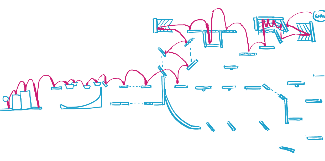
Once we had agreed upon a list of level mechanics we wanted to include, I began working on a test scene in Unity, using a combination of Unity's physics tools and C#. The anti-gravity platforms were particularly challenging to implement. It was also in this test scene where I started fine-tuning the player controller.
A large part of the assignment was about learning how to work in scrum sprints as a part of a small team. As such, I also took on organisational tasks for the project, drafting twice-weekly meeting agendas and taking minutes, as well as occasionally chairing meetings.
Taking on an active role in team management allowed me to check in with my teammates frequently to ensure we were all on the same page and get quick feedback. It also helped when I needed to communicate ideas about the direction of the project, such as when we were deliberating level themes.
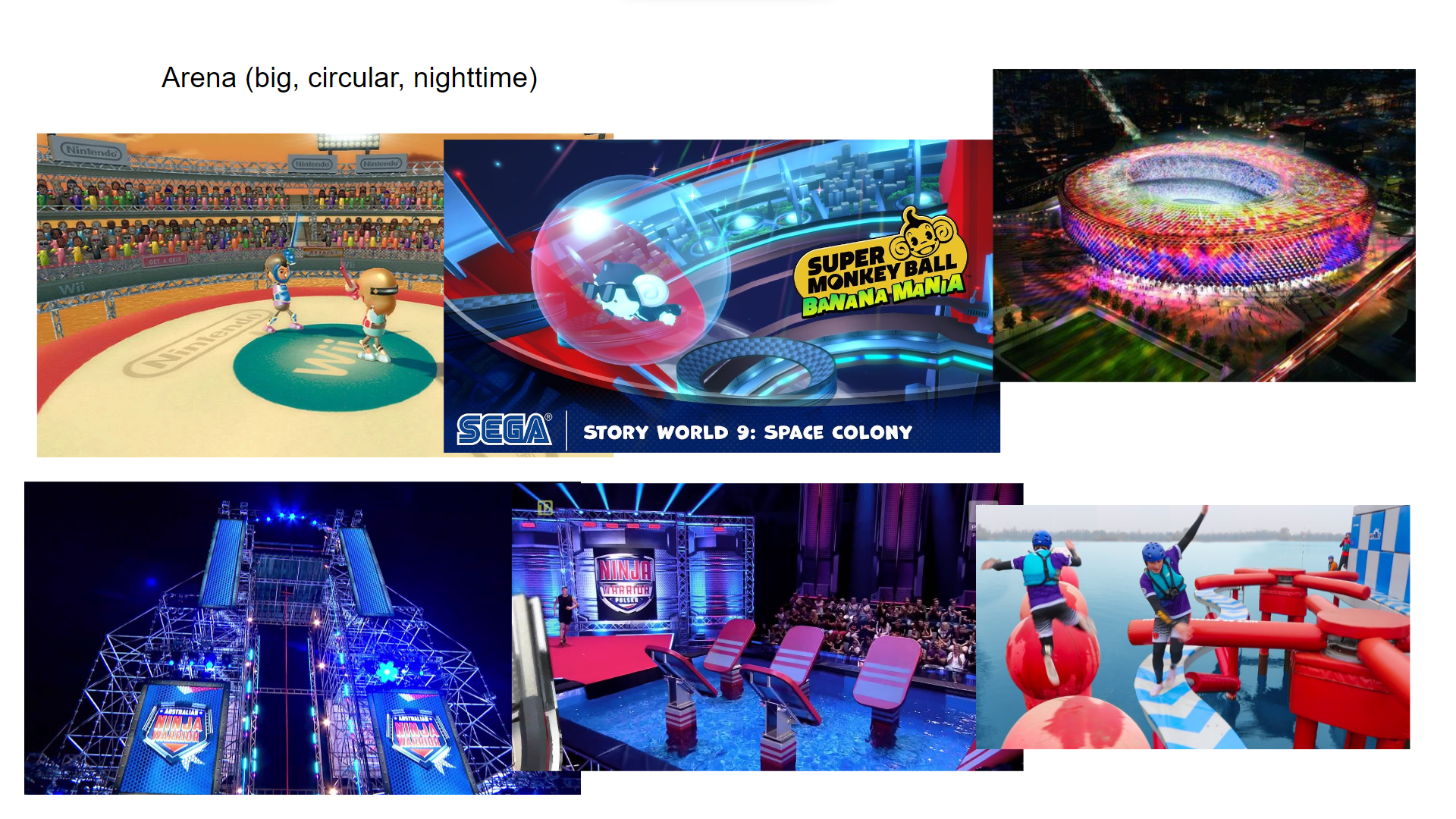
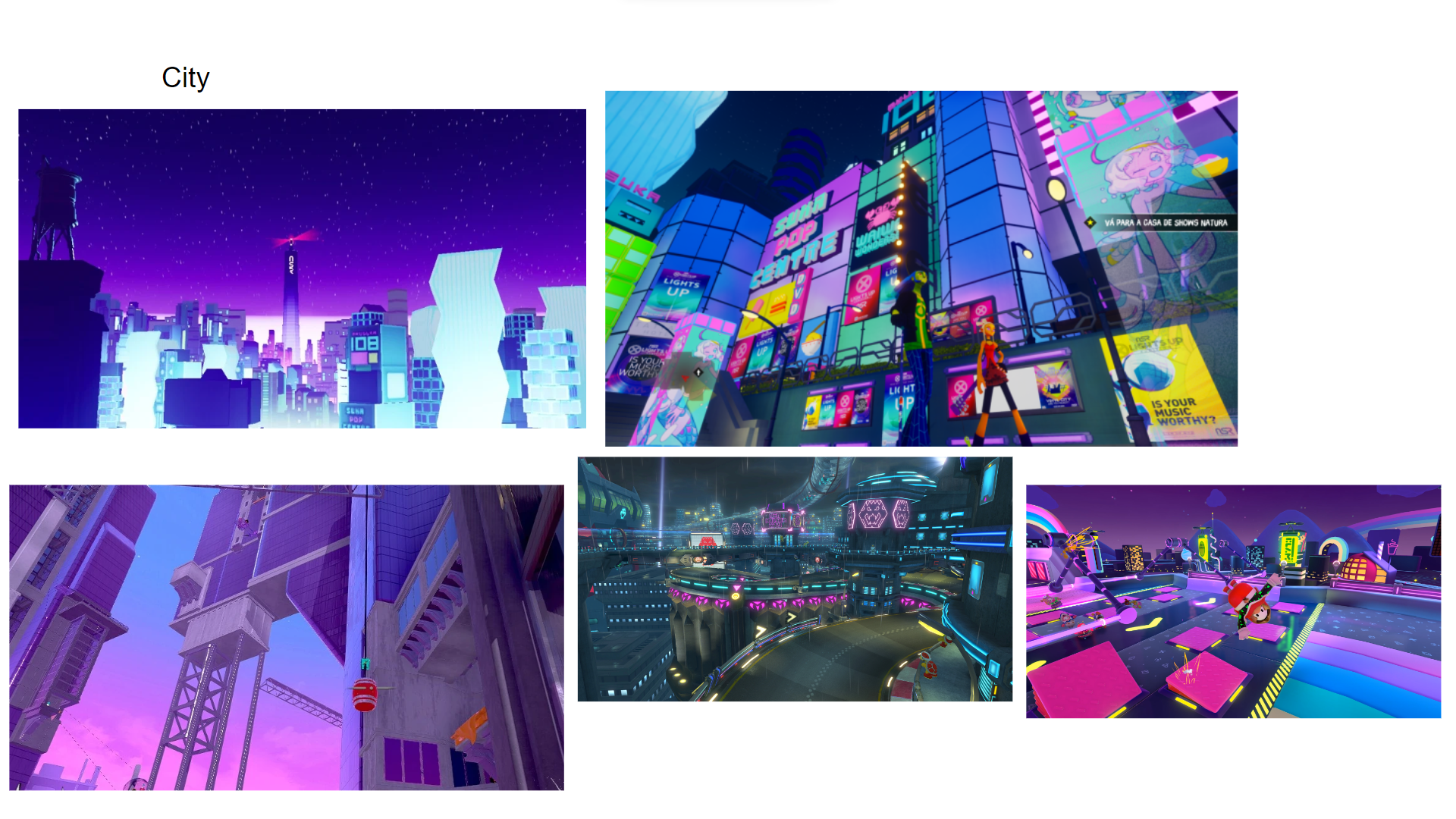
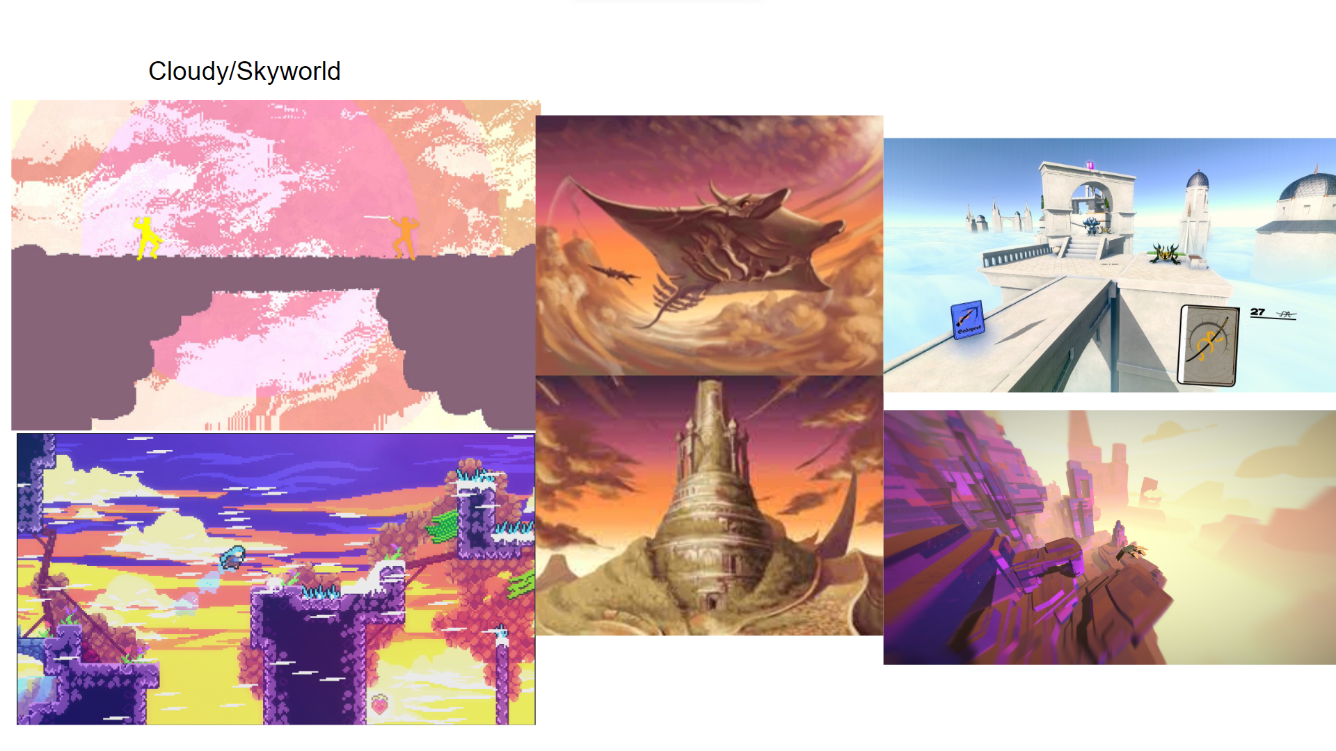
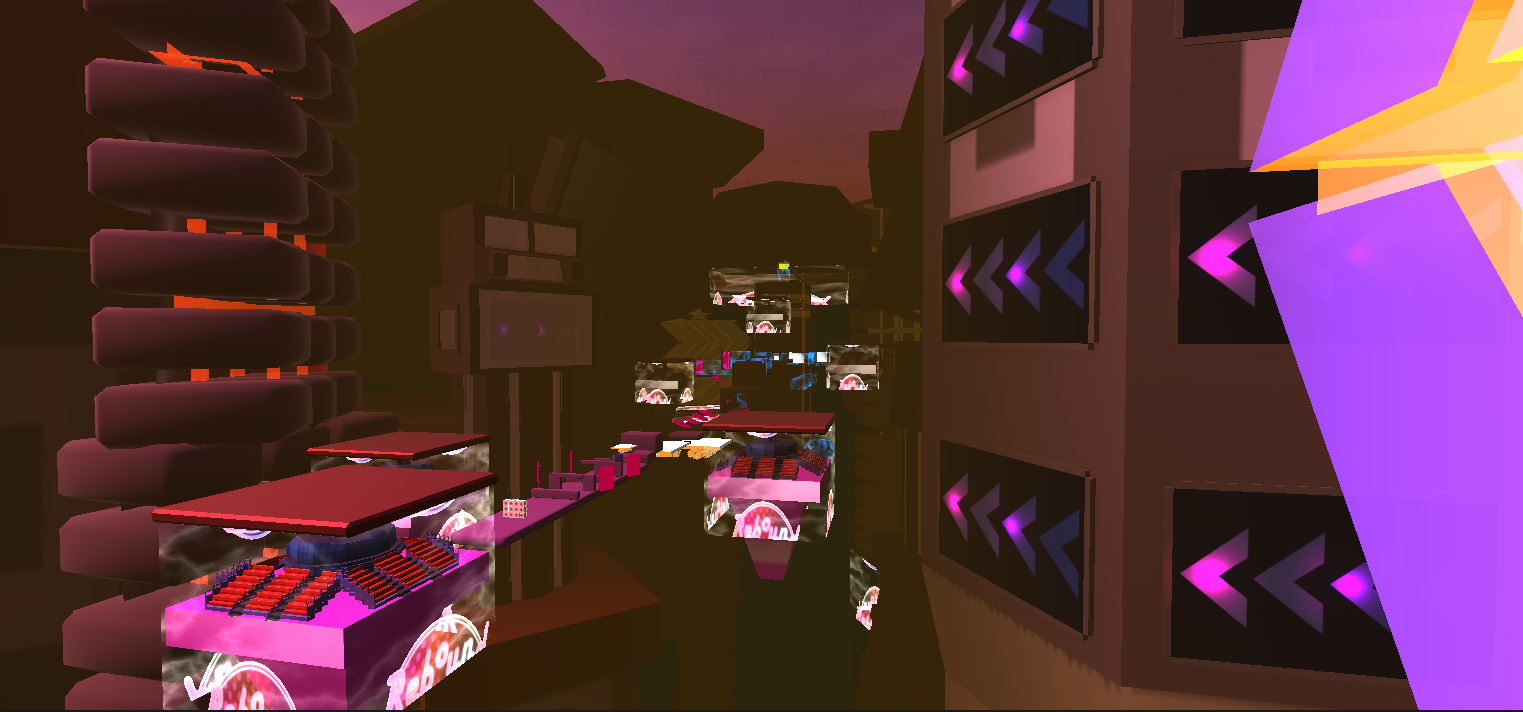
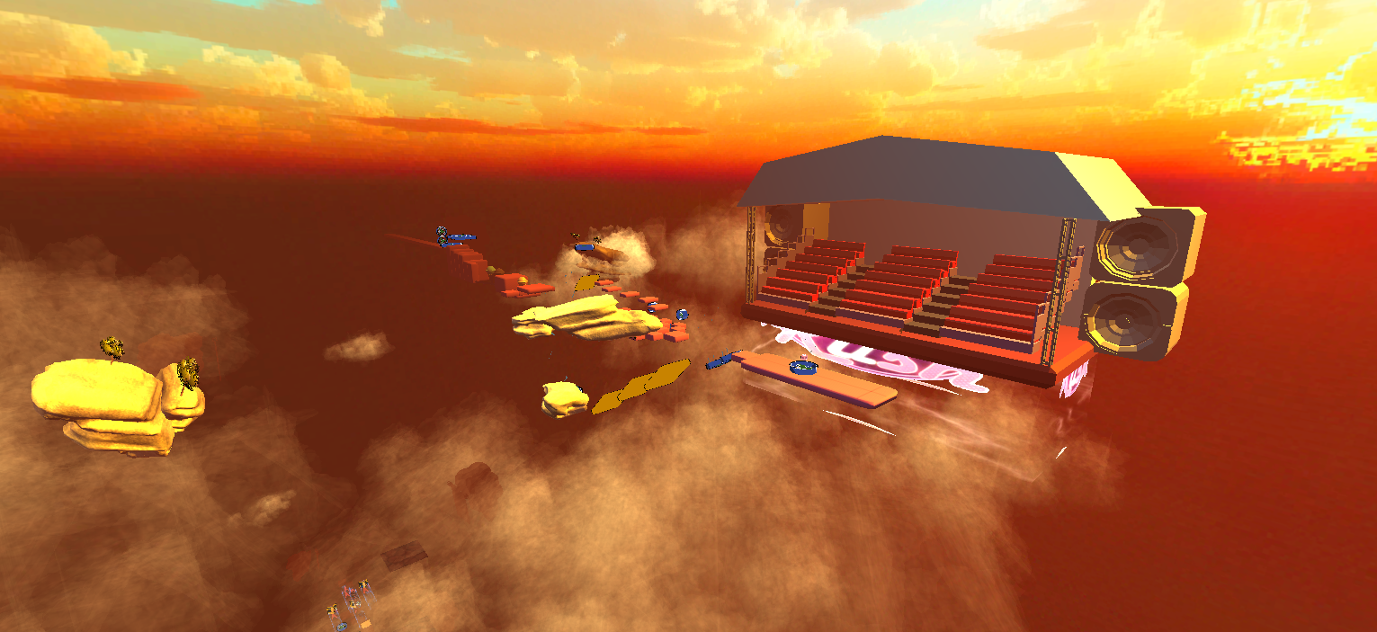
Moodboards were a particularly useful tool for communicating the visual direction of the game's levels to our artists. As level designer, it was important for me to take into account the types of environments the levels would take place in so that the mechanical (and difficutly) progression felt cohesive.
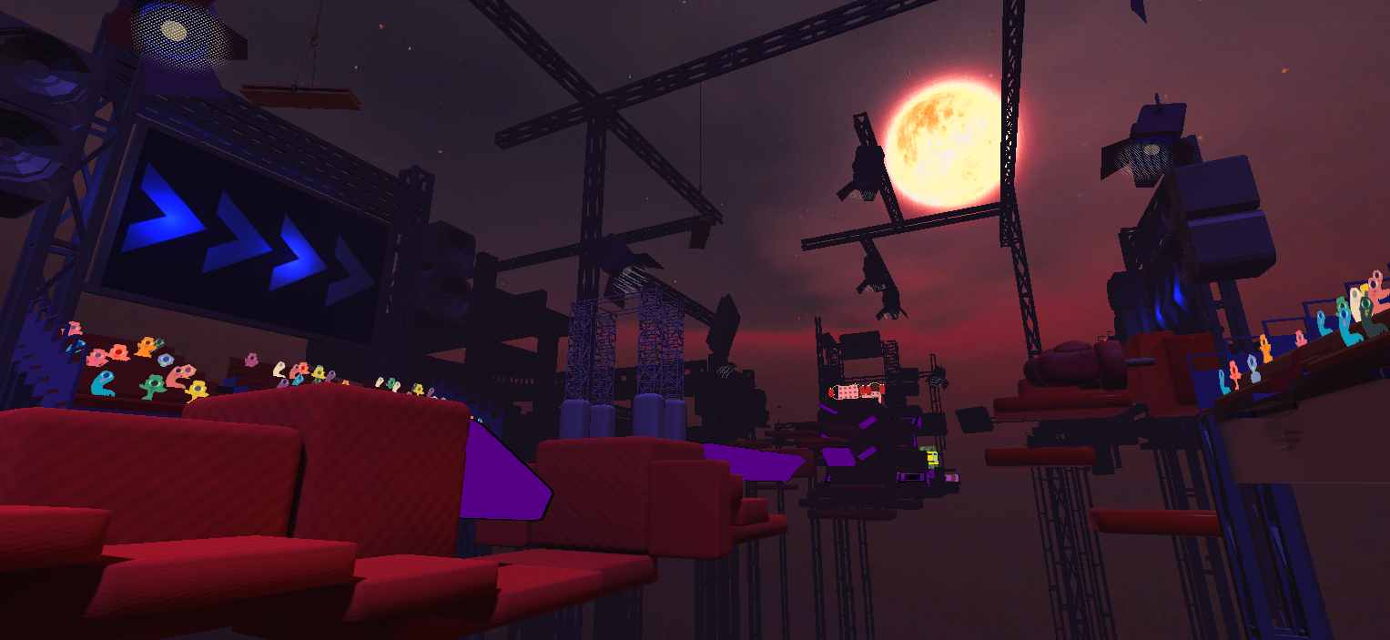
With this in mind, I began greyboxing level designs, starting with the level one: the arena. Under the conditions of the project, we were not allowed to conduct playtesting, so tested the designs internally. This was invaluable. Because I designed and programmed many of the mechanics myself, as well as the levels, it was challenging for me to gauge the difficulty of the game.
I learned a lot about communication on this project, both in terms of communicating mechanics and level routes through design and communicating with my teammates. Demoing the project at both the Interactive Media 2023 Showcase and Aesthetica Short Film Festival and seeing the game in the hands of players only emphasised the importance of playtesting!
If I were to continue this project, I would definitely develop a dedicated diegetic tutorial, as I saw once players had a handle on the controls, they had a lot of fun, but for many it took some additional explanation to get to that point. The game could also be expanded to include more levels per world, which introduce mechanics more gradually.
If you're interested in learning more about the development of this project, you can find the full report here.
